AI slop CLI
Border accent on rounded element
Thick accent border on a rounded card. The border clashes with the rounded corners. Remove the border or the border-radius.
See in /impeccableThe visible tells of AI design
37 patterns that mark an interface as AI-generated, and the detection overlay that catches them in place. Watch it flag them live, try it on 11 synthetic specimens, or browse the full catalog. 25 rules run deterministically (npx impeccable detect or the browser extension); 12 need /impeccable critique's LLM review pass.
Every wave of AI-generated UIs converges on a recognizable aesthetic. The detector catches both. The patterns just change.
Hover or tap any outlined element to see which rule fired. Toggle the era to see how the patterns shifted.
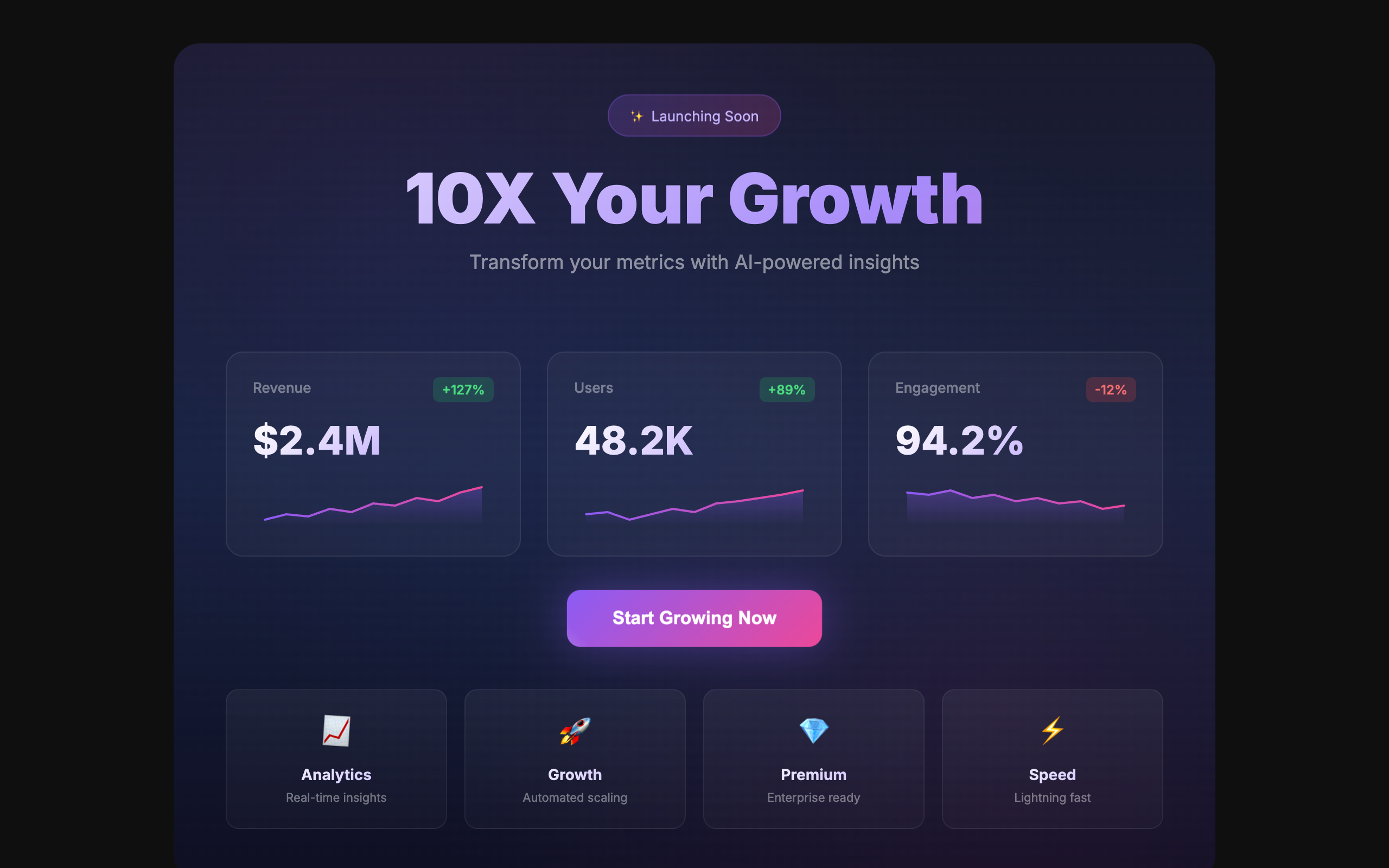
These 11 synthetic slop pages ship with the detector script baked in. Click any to see the overlay running on a real page, then hover the outlined elements.
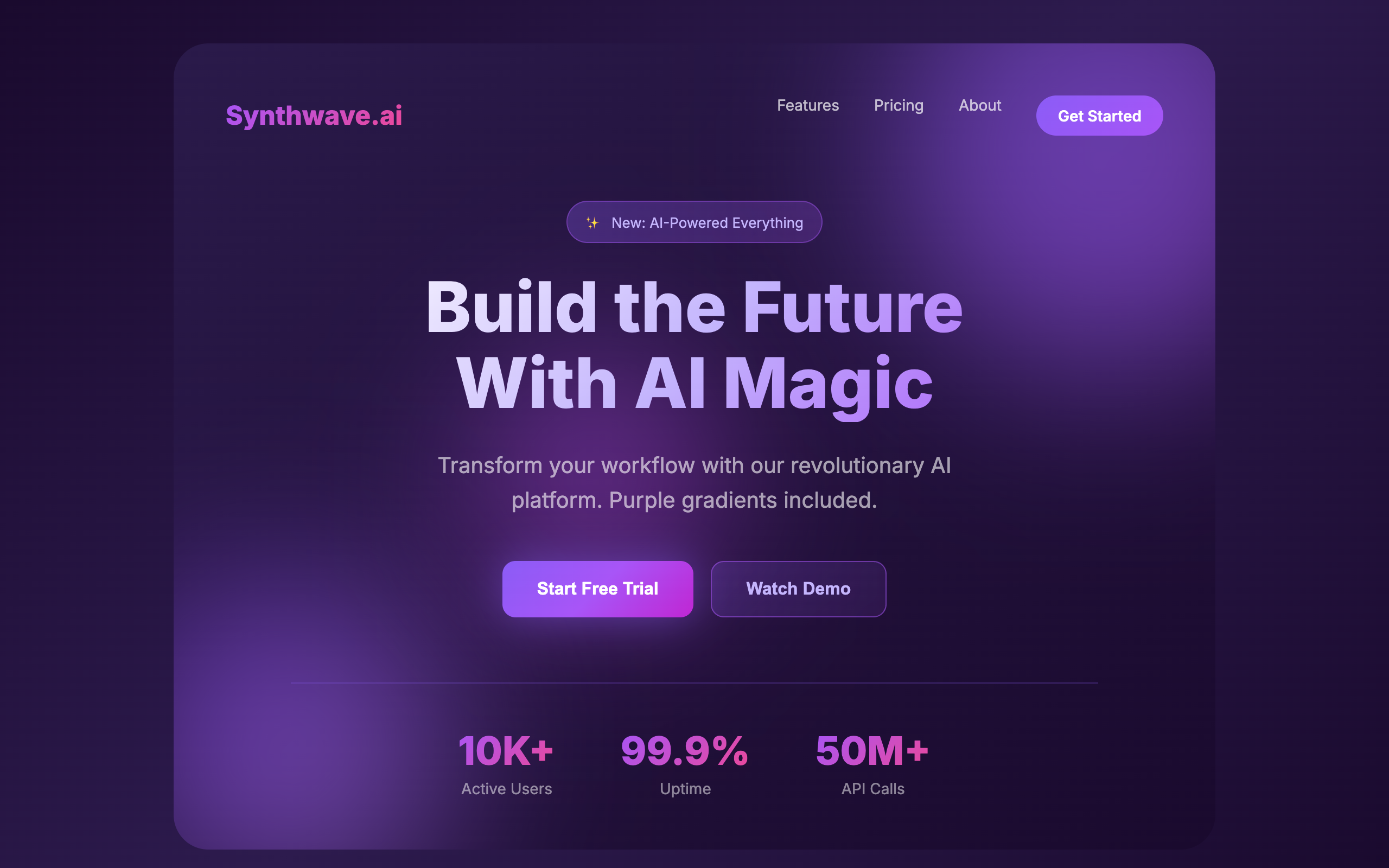
The AI color palette: purple-to-blue gradients on everything. Buttons, text, backgrounds, orbs. The new "make it pop."
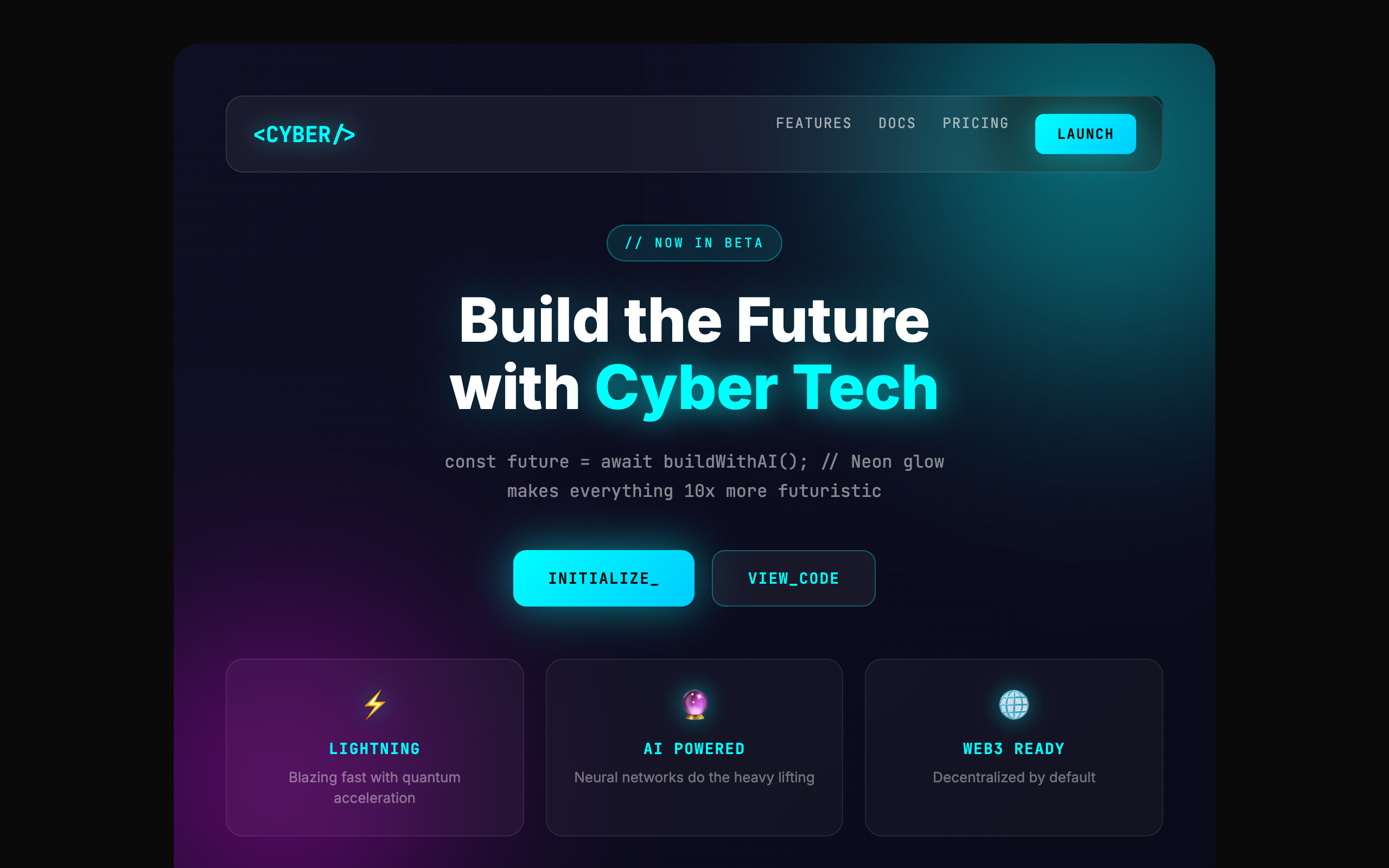
Glassmorphism, neon glows, blurred orbs, monospace everything. Looks like a hackathon project, not a product.
When in doubt, animate everything. Bouncing buttons, wiggling icons, gradient text, floating badges. Motion without meaning.
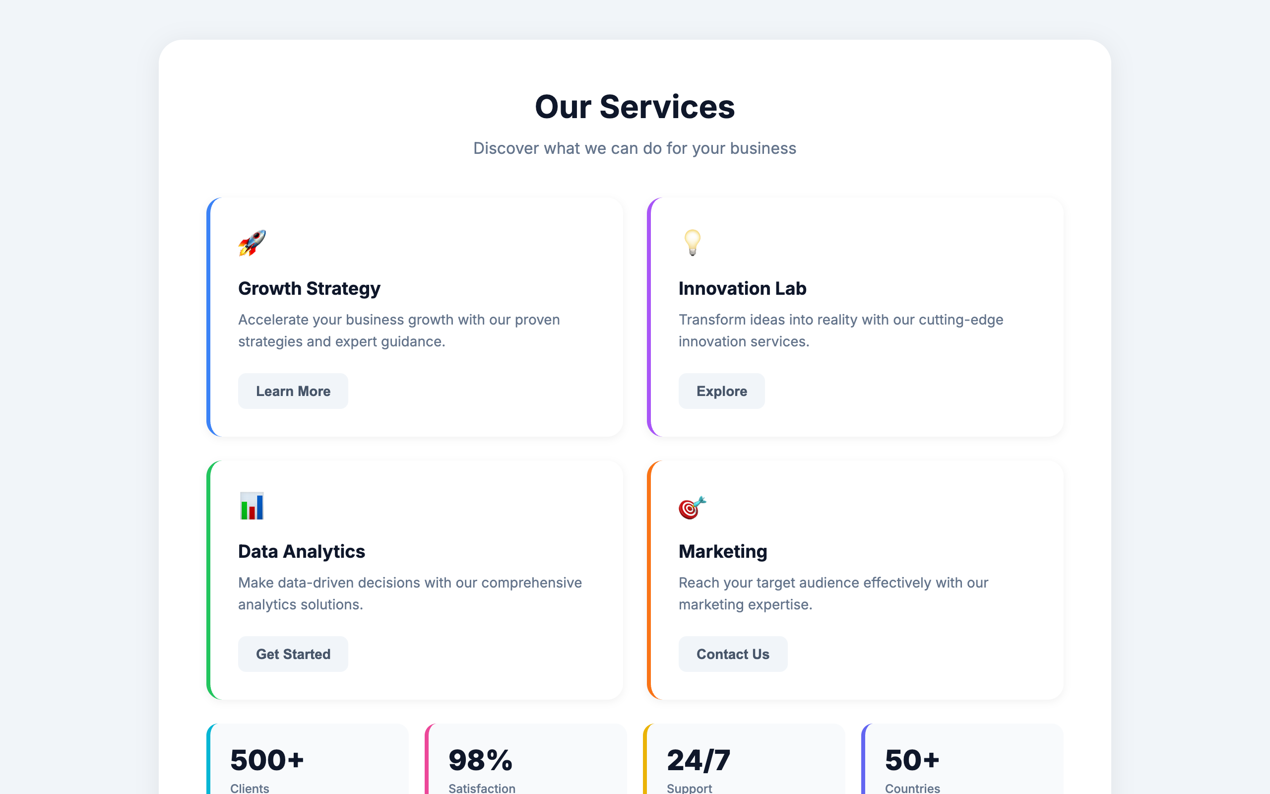
A thick colored border on one side of a rounded card. The single most recognizable tell of AI-generated UI.
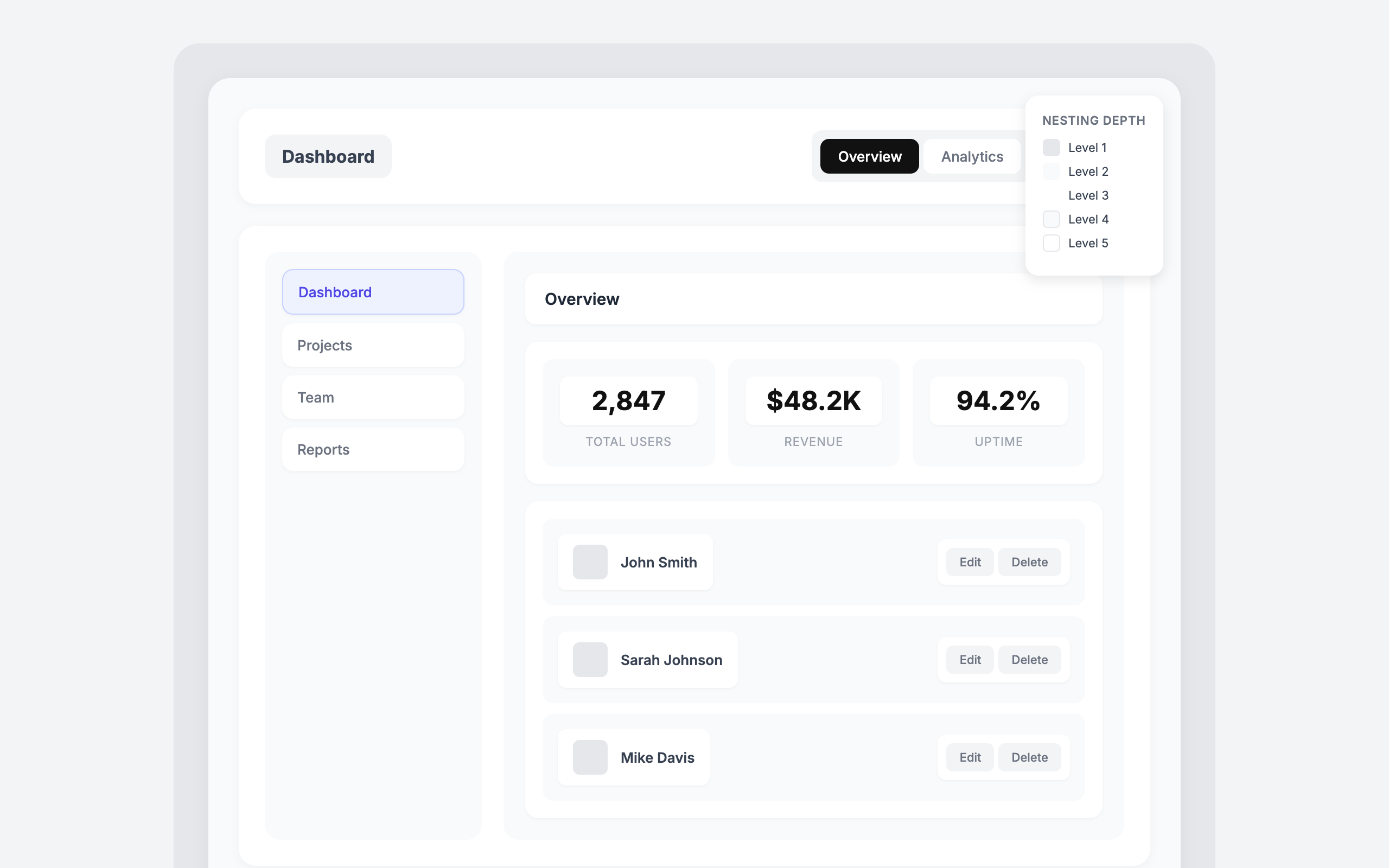
Cards inside cards inside cards. Five levels of nesting, each with its own padding and shadow.
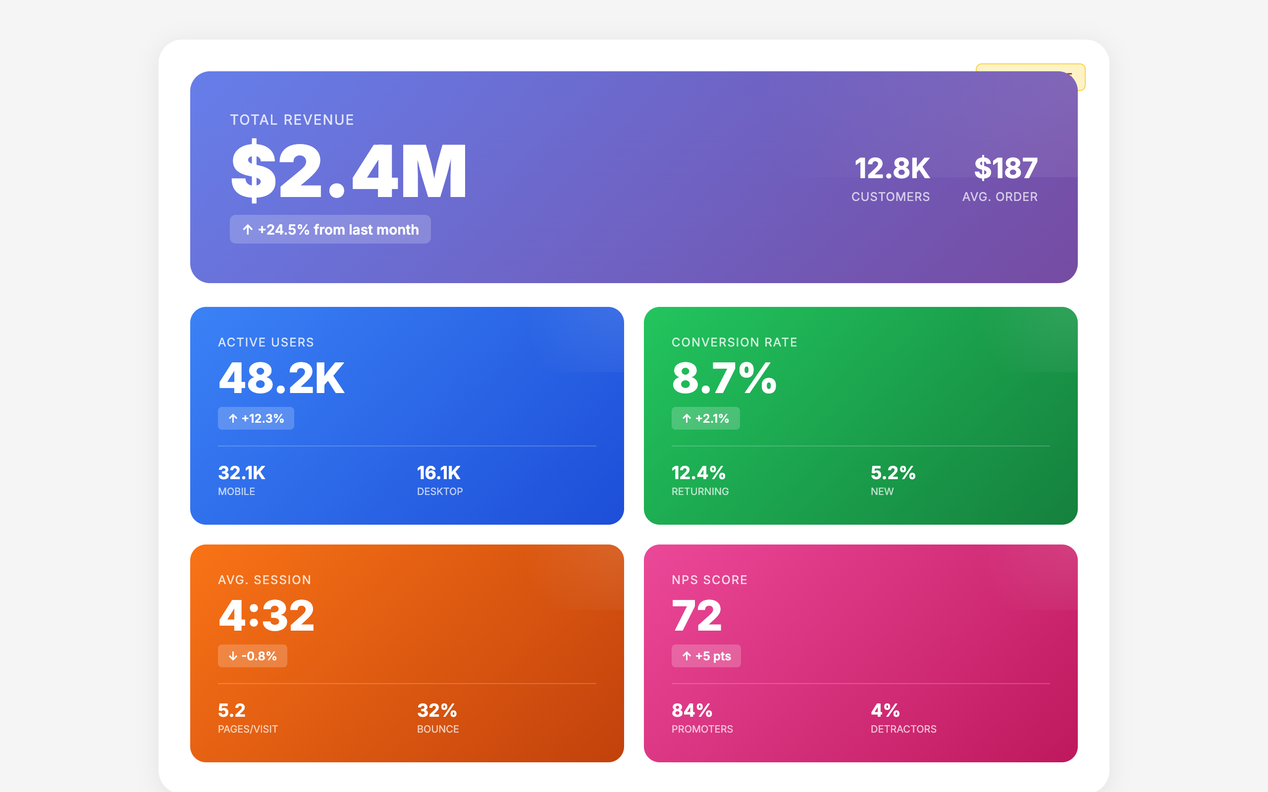
The same hero-metric-features template repeated with different colors. When every section looks the same, nothing stands out.
One font for everything. Headings, body, labels, buttons. No typographic hierarchy, no personality, no design.
Icon containers larger than the content they introduce. When the decoration is bigger than the message, priorities are backwards.
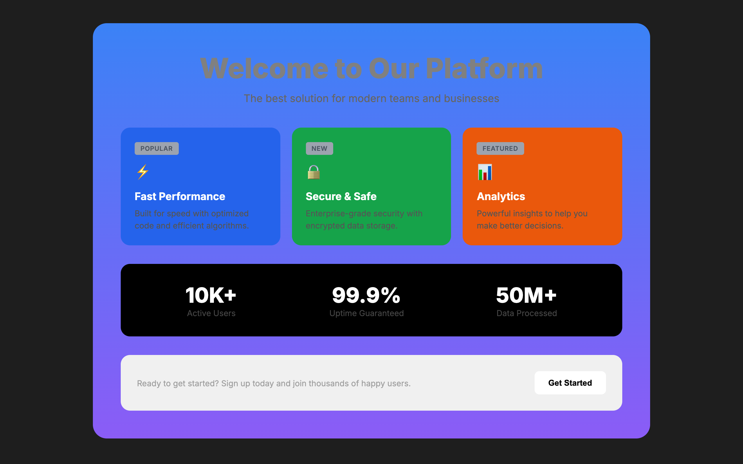
Gray text on colored backgrounds, low-contrast labels, unreadable combinations. Looking good and being readable should not conflict.
Label, sublabel, helper text, and hint text all saying the same thing in slightly different words. Say it once, say it well.
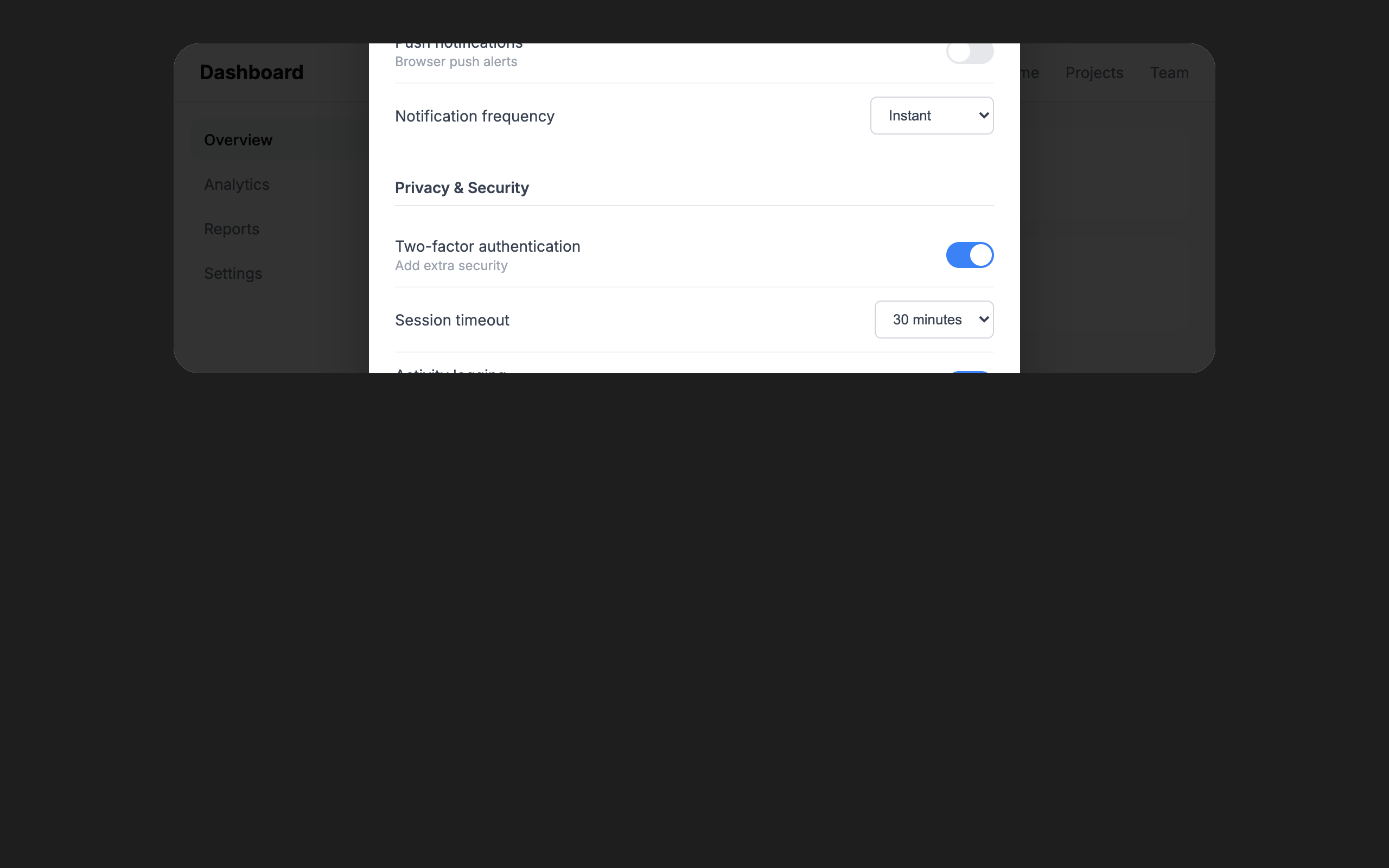
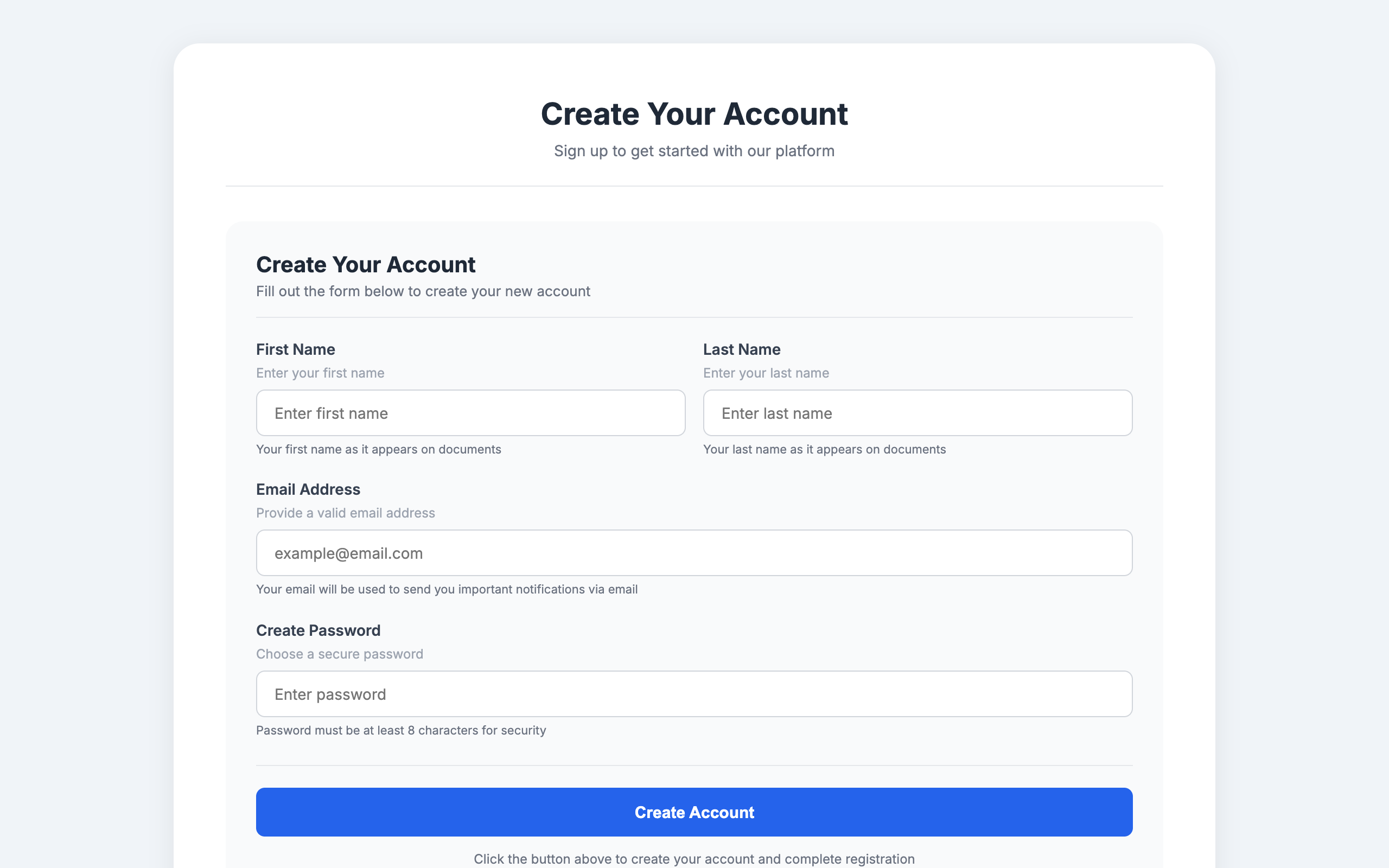
Complex settings crammed into a modal. If it needs a scroll bar and three columns, it deserves its own page.
Every pattern /impeccable teaches against. AI slop rules flag the tells of AI-generated UIs; Quality rules flag general design mistakes that hurt regardless of who wrote them.
Each rule shows how it is detected:
npx impeccable detect on files, no browser required.6 rules
Thick accent border on a rounded card. The border clashes with the rounded corners. Remove the border or the border-radius.
See in /impeccableBlur effects, glass cards, and glow borders used as decoration rather than to solve a real layering problem.
See in /impeccableModals interrupt the user and are lazy as a design default. Use them only when there is truly no better place for the interaction.
See in /impeccableThe safest, most forgettable shape on the web. Could be the output of any AI. Commit to a stronger visual treatment.
See in /impeccableThick colored border on one side of a card. The most recognizable tell of AI-generated UIs. Use a subtler accent or remove it entirely.
See in /impeccableTiny charts that look sophisticated but convey no meaningful information. If the data matters, give it room.
See in /impeccable6 rules
Font sizes are too close together. No clear visual hierarchy. Use fewer sizes with more contrast (aim for at least a 1.25 ratio between steps).
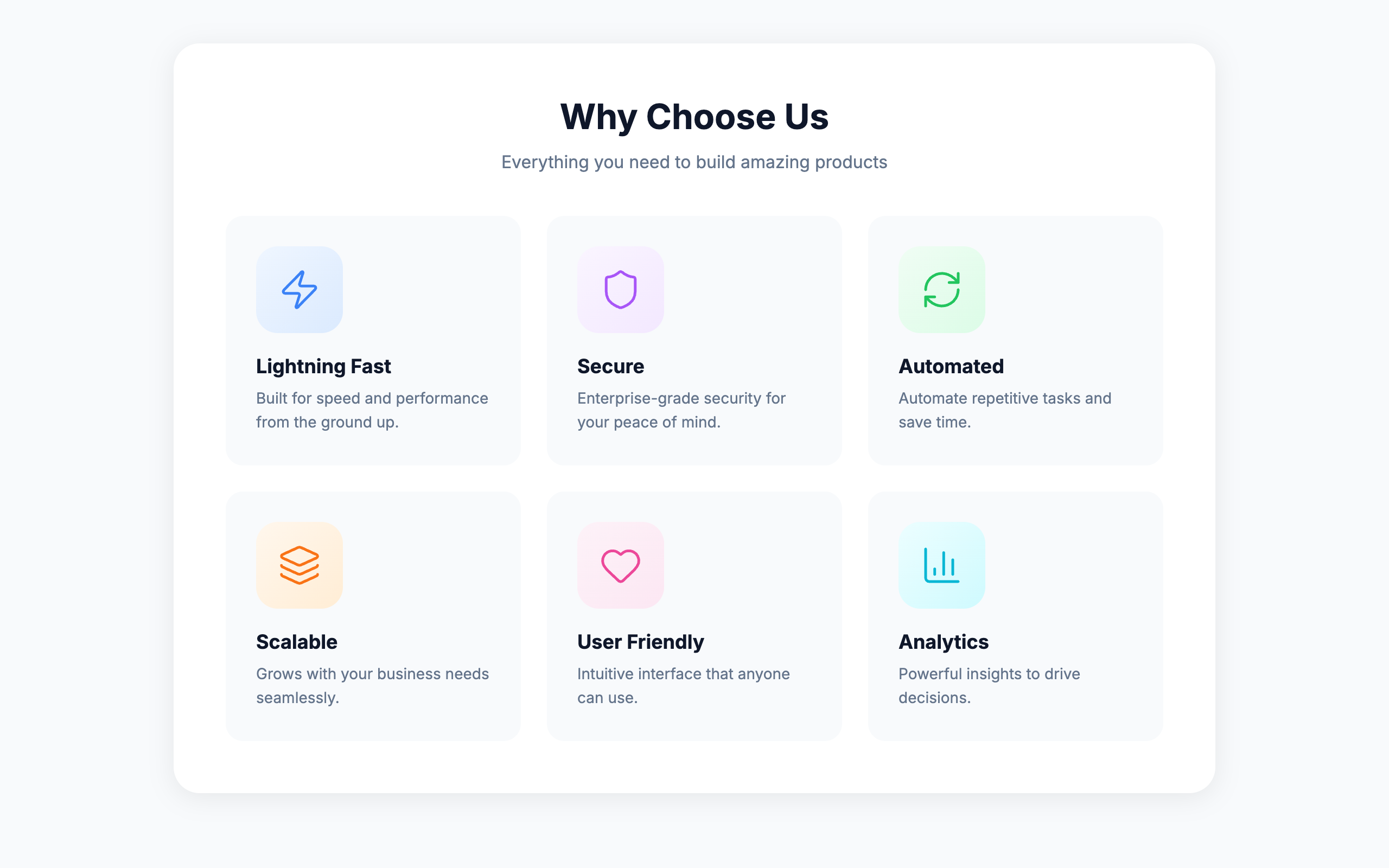
See in /impeccableA small rounded-square icon container above a heading is the universal AI feature-card template. Every generator outputs this exact shape. Try a side-by-side icon and heading, or let the icon sit in flow without its own container.
See in /impeccableUsing a monospace typeface to signal "developer / technical" vibes. Reach for real type choices instead of a lazy stereotype.
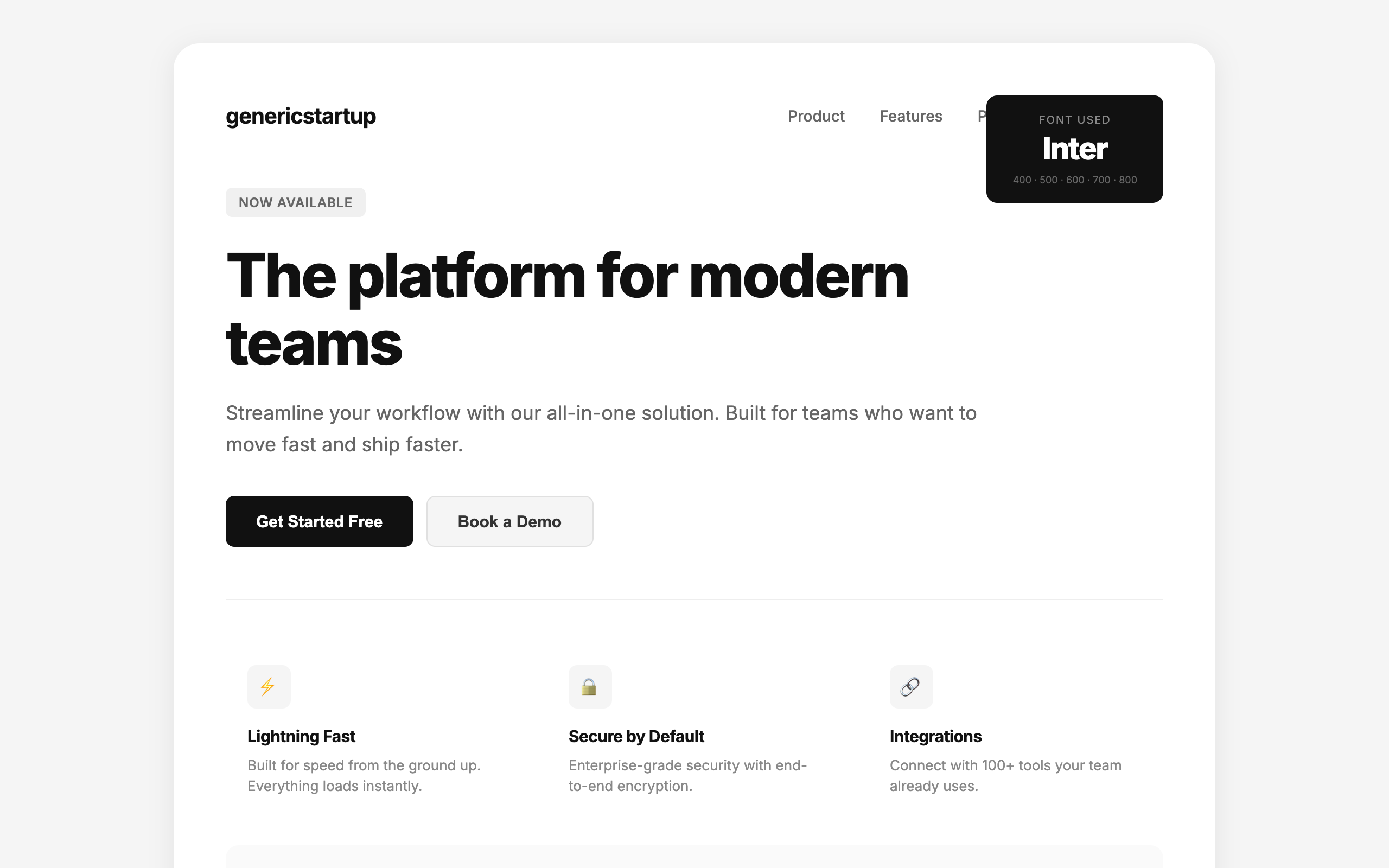
See in /impeccableInter, Roboto, Fraunces, Geist, Plus Jakarta Sans, and Space Grotesk are used on so many sites they no longer feel distinctive. Each new wave of AI-generated UIs converges on the same handful of faces. Choose a face that gives your interface personality.
See in /impeccableOnly one font family is used for the entire page. Pair a distinctive display font with a refined body font to create typographic hierarchy.
See in /impeccableLong passages in uppercase are hard to read. We recognize words by shape (ascenders and descenders), which all-caps removes. Reserve uppercase for short labels and headings.
See in /impeccable6 rules
Purple/violet gradients and cyan-on-dark are the most recognizable tells of AI-generated UIs. Choose a distinctive, intentional palette.
See in /impeccableDark backgrounds with colored box-shadow glows are the default "cool" look of AI-generated UIs. Use subtle, purposeful lighting instead, or skip the dark theme entirely.
See in /impeccableDefaulting to light mode to be safe is the inverse of defaulting to dark mode to look cool. Either way you are retreating from a decision.
See in /impeccableGradient text is decorative rather than meaningful. A common AI tell, especially on headings and metrics. Use solid colors for text.
See in /impeccableGray text looks washed out on colored backgrounds. Use a darker shade of the background color instead, or white/near-white for contrast.
See in /impeccablePure #000000 as a background color looks harsh and unnatural. Tint it slightly toward your brand hue (e.g., oklch(12% 0.01 250)) for a more refined feel.
See in /impeccable7 rules
Every text element is center-aligned. Left-aligned text with asymmetric layouts feels more designed. Center only hero sections and CTAs.
See in /impeccableBig number, small label, three supporting stats, gradient accent. Used everywhere, trusted nowhere.
See in /impeccableSame-sized cards with icon + heading + text repeated endlessly. The default AI homepage layout.
See in /impeccableThe same spacing value used everywhere. No rhythm, no variation. Use tight groupings for related items and generous separations between sections.
See in /impeccableCards inside cards create visual noise and excessive depth. Flatten the hierarchy: use spacing, typography, and dividers instead of nesting containers.
See in /impeccableNot every piece of content needs a bordered container. Spacing and alignment create visual grouping without the overhead of a card.
See in /impeccableText lines wider than ~80 characters are hard to read. The eye loses its place tracking back to the start of the next line. Add a max-width (65ch to 75ch) to text containers.
See in /impeccable2 rules
Bounce and elastic easing feel dated and tacky. Real objects decelerate smoothly. Use exponential easing (ease-out-quart/quint/expo) instead.
See in /impeccableAnimating width, height, padding, or margin causes layout thrash and janky performance. Use transform and opacity instead, or grid-template-rows for height animations.
See in /impeccable2 rules
When every button looks equally important, nothing reads as the primary action. Use ghost buttons, text links, and secondary styles to build hierarchy.
See in /impeccableIntros that restate the heading. Section labels that repeat the page title. Cards that echo their own caption. Make every word earn its place.
See in /impeccable1 rule
Hiding critical functionality on mobile because it is inconvenient. Adapt the interface to the context, do not strip it.
See in /impeccable7 rules
Text is too close to the edge of its container. Add at least 8px (ideally 12-16px) of padding inside bordered or colored containers.
Justified text without hyphenation creates uneven word spacing ("rivers of white"). Use text-align: left for body text, or enable hyphens: auto if you must justify.
Text does not meet WCAG AA contrast requirements (4.5:1 for body, 3:1 for large text). Increase the contrast between text and background.
Heading levels should not skip (e.g. h1 then h3 with no h2). Screen readers use heading hierarchy for navigation. Skipping levels breaks the document outline.
Line height below 1.3x the font size makes multi-line text hard to read. Use 1.5 to 1.7 for body text so lines have room to breathe.
Body text below 12px is hard to read, especially on high-DPI screens. Use at least 14px for body content, 16px is ideal.
Letter spacing above 0.05em on body text disrupts natural character groupings and slows reading. Reserve wide tracking for short uppercase labels only.
Inside /impeccable critique
The design review command opens the overlay automatically during its browser assessment pass. Deterministic findings highlighted in place while the LLM runs its separate heuristic review.
Standalone CLI
npx impeccable liveStarts a local server that serves the detector script. Inject it into any page via a <script> tag to see the overlay. Works on your own dev server, a staging URL, or anyone's live page.
Easiest
One-click activation on any tab. Install from Chrome Web Store →